Introduction
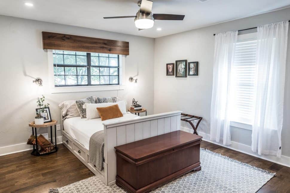
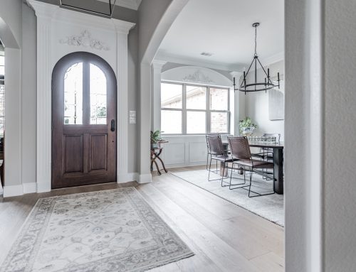
Color is a powerful force. It can influence the body, mind, and spirit, and can change the way you feel in a matter of seconds. Whether you’re designing your home or office space, color psychology is the key to creating environments that promote relaxation, focus, and overall well-being, such as this beautiful guest bedroom featured to the right.
With that in mind, let’s explore the impact of colors on your mood and provide insights into choosing the right colors palette for your master bedroom!
The Impact of Colors on Your Emotions:
Colors can have a profound effect on your emotional and physical state. They can either boost your mood or bring it down further, so it’s very important to note how you respond to different colors.
Let’s First Consider the Negative Effects of Colors:
- Mood Changes: Certain colors can consistently bring down your mood, making you feel anxious, stressed, or irritable. Vibrant reds and electric yellows, for example, might be overwhelming for some individuals.
- Restlessness: Colors that make you feel restless or agitated indicate a negative response. Vivid and aggressive colors can contribute to this discomfort.
- Difficulty Concentrating: If a color makes it hard for you to focus or concentrate, it’s not conducive to your mental state. Intense oranges or bright yellows, for instance, can distract from tasks.
- Feelings of Depression: Some colors may trigger feelings of sadness or depression. Consistently feeling down when surrounded by a particular color warrants consideration.
- Negative Associations: Personal experiences and cultural associations can also impact your reaction to colors. Negative memories or emotions linked to a color can affect you negatively.
- Disruption of Sleep: The colors in your bedroom can impact your sleep quality. If your bedroom’s color scheme hinders relaxation and sleep, it may negatively affect your sleep patterns.
- Feelings of Overwhelm: Intense or contrasting colors can create a sense of overwhelm. If a color dominates your surroundings and causes discomfort, it may be negatively affecting you
Now Let’s Talk About the Positive Effects:
- Elevated Mood: Colors that consistently make you feel happy, calm, or content have a positive effect. Soft blues and gentle greens, for example, promote a positive mood.
- Feeling Energized: Certain colors can evoke feelings of energy and vitality, invigorating and motivating you.
- Physical Comfort: Colors can create a sense of comfort and coziness. Feeling physically at ease in a colored environment is a sign of a positive response.
- Improved Focus: Colors can enhance your ability to concentrate and focus. A room with the right color can boost productivity and attentiveness.
- Feelings of Inspiration: Colors associated with creativity and inspiration encourage imaginative thinking and open-mindedness.
- Positive Associations: Colors linked to positive memories or emotions tend to have a positive impact on your mood.
- Sense of Calm: Colors that create a serene and tranquil atmosphere have a calming effect.
- Enhanced Comfort: Colors that resonate with your preferences make you feel more comfortable and at home.
- Increased Confidence: Some colors can boost your confidence and self-esteem.
Choosing The Right Color for Your Master Bedroom
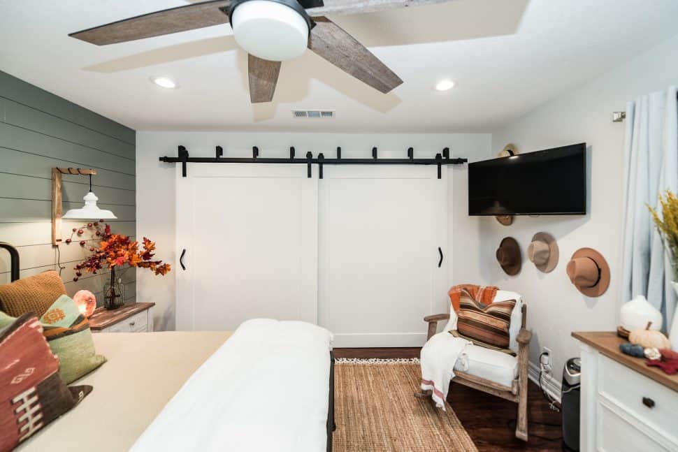
Your master bedroom should be a sanctuary. A safe place you can escape to after a long day or peaceful haven you can rest in on a sick day. It is only fitting that you would want a master bedroom carefully designed with the utmost care and attention to detail. Soft blues, greens, lavender, and neutral tones envelop the space in a soothing and tranquil ambiance. These carefully chosen colors serve a profound purpose – to promote relaxation and restfulness. Take this image from our Courtyard Casa project for example. As one steps into this cozy little refuge, the calming palette immediately sets the tone, creating an atmosphere of serenity and peace. The gentle green of the wall whisper of lush meadows and tranquil forests, while the neutral tones of the bedding and accent items radiate a sense of stepping into a relaxing weekend retreat.
Every element in this bedroom is meticulously curated to enhance its purpose. From the plush bedding that cradles you in comfort to the gentle lighting that bathes the room in a warm, soft glow, every detail is aimed at creating an oasis of relaxation. Soft textures and subtle patterns add to the overall sense of comfort and tranquility, inviting you to leave behind the cares of the day and embrace the serenity of the night. In this space, the boundaries between indoors and outdoors blur, allowing one to reconnect with the natural world and find solace in the embrace of the bedroom’s calming colors. It is a place where restfulness reigns supreme, and the worries of the day gently fade into the background, leaving only a sense of peaceful serenity.
And for a little bonus tip to enhance this sense of relaxation, consider adding some lavender into your space. With its delicate fragrance, some little sprigs of lavender can add an extra layer of calm, inviting the weary soul to unwind.
Note: Before making a final decision, consider testing paint swatches or creating mood boards to see how different color combinations resonate with you and the atmosphere you want to create in your room. Painted samples can give you a much more accurate preview of a paint color. We recommend using Samplize – our go-to resource for trying out paint colors. With Samplize, you can get peel and stick paint samples delivered overnight to test in your own space! You can explore sample options from Sherwin Williams to Benjamin Moore, as well as exploring bundles and collections. Unleash your creativity and get started on testing your colors by using our affiliate link here.
Dark vs. Light Colors in the Bedroom:
When it comes to choosing between dark and light colors for your bedroom, consider factors like room size, natural light, personal preferences, and desired mood:
Light Colors:
- Make small rooms feel more spacious.
- Reflect more light, creating a bright and airy atmosphere.
- Associated with calmness and tranquility.
Dark Colors:
- Create a cozy and intimate atmosphere in larger bedrooms.
- Add a sense of luxury and elegance.
- Absorb light, making the room feel cocoon-like and private.
- You can also use a combination of both light and dark colors for balance and dynamism.
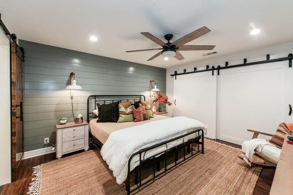
Note: Our Nautical Navy Bunkhouse project featured above is a perfect example of how to brilliantly combine light and dark colors for stunning contrast!
Colors for Rest:
For restful environments, we suggest using calming and soothing colors like soft blues, greens, lavender, gray, neutral tones, soft pink, earth tones, and white. These colors promote tranquility and relaxation, ideal for bedrooms and spaces intended for unwinding.
Conclusion:
Color psychology is a valuable tool in designing spaces that align with your desired emotions and purposes. By understanding the impact of colors on your mood and choosing them thoughtfully, you can create environments that promote well-being, relaxation, and focus in your home and office. Experiment with different color palettes and arrangements to find what works best for you and enhances your quality of life.

Leave A Comment